
Self analysis for NTU industry week- Live brief
Duration of project: 2 weeks
Role in project: Lead designer
Brief
The brief asks us to create an energetic identity to represent Confetti’s 18th Annual Industry Week’. It must have a visual appeal to students within Confetti, as well as representing confetti as a great creative education centre.
It should include the event’s logo, colour palette, typography choice, mock-ups for promotional areas in real life scenarios. (e.g., Instagram post/stories, as a banner on the street or within the university itself).
Why did I choose this brief
Being a student myself, I value the creativity that Confetti is trying to provide for their students, and the representation that follows. Gathering data from the students I work alongside should provide me with a good take on the market that this poster should adhere to. My target audience is students, or potential students, that have an interest in studying or finding out more about their course.
My demographic should typically be around ages 16 – 40+, the idea should show this audience that Confetti has the potential to inspire and allow creative freedom to those that chose to commit and partake in their courses. It is also the cause of appealing to these people and reinforcing the philosophy of Confetti of ‘Do it for real,’ meaning that they plan to create opportunities for creative youths.
Market research (Include graphs of how many students want to partake in creative subjects and their worries)
The market in question consists of students within the Confetti area to be encouraged to explore and seek inspiration and advice from people who have worked within their study's topic.
Confetti were first established in 1994, by Craig Chettle, who created a space that allowed young people to access creative industries. The root of all this came from the idea of teaching those who wanted to get into the creative industry to learn firsthand from those within the industry itself, instead of books. He later joined the institute to Trent’s university in 2015, as the demand for more creative courses grew.
Nottingham Trent's competitors are mainly other art technology-based universities such as Loughborough, Reading, UWE Bristol, Leeds Arts, Manchester Met, Edinburgh and Staffordshire. They tend to focus on vibrant colours within their campaigns, as now graphic designers are starting to use this more often and take advantage of how screens are now adapted to show these colours much better now than ever before.
Another new trend that designers are currently taking advantage of is the layout design called ‘Bento Boxes’, sort of like a style ‘’Figma’ layout, but it’s easier to organize and place content within each section that’s relative to that topic.

It’s inspired by the metro design language that was created by Microsoft, it involves easy to read typography and simplified icon designs. Generally, it looks more organized overall, that's why a lot of software like Xbox, windows and outlook have incorporated this concept into their layouts.
Utilitarian designs is another trend that many designers are using in contemporary advertisements, meaning the design utilizes all functional aspects e.g. grides, negative space, colour theory etc. This is an aesthetic within itself that cuts down to a more ‘minimalist’ feel, a little bit more geometric and sci-fi themed.
The use of serif fonts is increasing now as well, as it gives more character to the text compared to the very conservative sans serifs, it's easier to individualize the typeface. The reason why companies stuck to sans seifs in the past is due to the pixel quality of the design not being able to create a curvature in it’s characters, as it can do now.
I conducted primary research for how I should choose a theme by design by standing outside of the confetti building and asking students very briefing if they would pick one theme. Overall, I ended up getting around about 45 participants.
The questions were asked face to face and only took people a maximum of 3 minutes to answer. The issue with the results is that the themes chosen did not have any visual presentations alongside them, I just gave them a brief description of what the theme intended, which means that their answers are very objective to how they personally can picture that theme. It was still very helpful to understand what the student’s overall expectation would be for Confetti’s poster. The majority chose in the end that they would rather have a more colourful and symbolic design for industry week.

A Graph of the Results gained from my Survey
Colour Scheme
For the colour scheme in this poster I wanted to focus on a more atmospherically, space fantasy type of theme for the composition of this piece.
Taking inspiration, I have used in the mood board and from the mind map motive I have created, the vibrant, electric colours used I thought would be more suitable even though it’s stepping out of the past designs used for industry week. Past projects used for the event have been more geometrical and pastel colour orientated, so I considered experimenting with that.

My Mind Map

Colour Coding Guidlines

My Mood Board
Typography and layout
In the end, I decided not to stray too far away from the sans serif type face used previously in the confetti advertisements. This is with consideration of how busy the design is and did not want to overwhelm the viewer.
I tested out other fonts with the column-based titles to see what would tie the piece together best, and in the end thought that the font ‘Futura’ was the best fit. I set the type to only be a bright orange outline of the text, to be able to reveal the background textures I created using different brushes from a combination of procreate and photoshop. This allows an orange ‘tint’ to seep through. Still allowing the text to be clear enough for the viewer to recognise and read. It keeps its reformed and bold feel for the sake of the piece representing an institute of learning, whilst giving it an artistic edge at the same time.
Purposefully constructing a kind of ‘pop city poster’ aesthetic with the column-based titles using only very vibrant and contrasting, electric colours. Creating an isolated box for the numbers ‘20’ to sit on, placing behind it a texture bright red to give the boldness of the yellow to create dimension within the design. Using a specific texture from ‘Texturelabs’ to make it look collaged and as if it were ‘press printed’. The numbers are also in the font of ‘Futura’ but filled in with yellow to stand out much more sharply to contrast with the red.
Ethical Responsibilities
The design itself is more of a fun and educational, communal and promotive statement. Although, It does hold the social responsibility of being as inclusive as possible. To add to the fun element, I strayed away from using real life imagery of people and represented the creativeness of the institute using cartoon stylised animals. I used brush textures that were as close as possible to traditional water colours or oil paints to give it that very ‘down to earth’ feel. The design is purposefully light-hearted but is meant to be aspirational to young adults advancing in their careers in the creative industry. It’s created with the goal in mind to unite a community of people that hold the same artistic sentiment, and that childish format was imputed as a tribute to ‘how it all started’ for us.
In terms of environmental responsibility, the banner poster should be printed on FSC-certified, recycled paper, to ensure that the products we are using are checked to be Environmentally friendly. As well as the paper for the banner it should be printed using soy-based inks, as during the drying process it emits much less pollutants into the atmosphere, as well as being cost effective as it need much less ink to get the same vibrant colours for the design compared to its traditional counterparts.
Bamboo paper for the banner aspect of the advertisement is a good consideration to use, as the material doesn’t create the same water wastage compared to other material, nor does it need harmful pesticides in the growing process.
Minimizing the number of physical copies created is best to avoid waste being thrown onto the streets. If it’s possible to only create prints that people would need to buy and donate the proceeds to the institution for better equipment, that would be the best way to justify more physical copies. Primarily using social media to advertise the poster is the best way to reach the target audience and reduces the chances of waste and pollution being created.
Concept development and feedback on drafts and on ethical issues that may arise with it as well
I drew quick thumbnails of different concepts and ideas that I believed would be fun to expand on. I really liked the fish drawing that I used in the mood board and thought that I could use it in my own design.
I enjoyed the concept of using galaxy, planets, and space, mixed with a child’s imagination, and wanted that to be incorporated. There was a very cartoon like cloud in one inspiration image, which could have been a nice add on to personify as an idea from a ‘student.’ Using various kinds of borders and shapes to isolate and draw the viewer's eye to a different section of the piece would help create a mind map for viewers to follow. I also thought that would help create a mental dissection of different areas of detail when viewers examined the design. Giving it a three-dimensional feel that I wanted the viewers to experience.
Using a streetlamp in one thumbnail, to be that transition border between ‘space,’ the light that the streetlamp directed would have been the ‘creative thoughts’ that came from a person beneath it. A play on the ‘light bult idea’ saying, so people could make the connection between the two, which would give the piece a very wholesome vibe to it.
Creating an A4 drawing within my sketchbook. Originally, I was going to try and display a hand to avoid drawing or using real life imagery of a student but still giving the overall piece a human touch to it.
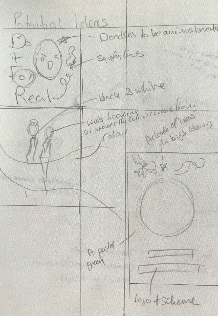
Concept Thumbnails

A Thumbnail Created as a Possible Concept
The hand would have had a ray of light that produced a cut border between creative images and drawings flowing from the hand, and then the outer border would contain the galaxy and space. Using that draft, I tried to figure out a suitable layout for the drawing as well as the word placement. I wanted there to be doodles that almost resembled Confetti’s past student’s doodles, to personalise the design. In the end the final pieces managed to hint at a Confetti like image from the way that I drew the galaxy and stars, as well as the colour choice for those elements

Thumb Nails
Final mock-up and Final Design outcome description
In another mock-up sketch, I thought about including the slogan said by the founder of confetti of ‘Do it for real,’ making it a tribute to the route of the institution and the meaning behind why everything came to fruition in the first place. In the end using a combination of the inspiration taken from the Confetti website and the mood board and research. Combining space with galaxy like imagery to flow through a blue textured painted back drop.

The Final Poster Design During Development
I created small ‘portals’ to break up the design and using brushes from procreate to draw trees and a red ribbon to symbolize the flow of creative direction. Giving the impression that the trees swaying in the wind to show that there is natural ‘pull’ drawing the imagery in, despite the galactic theme. I have painted in ‘fruit,’ a very piercing red to symbolise fruitarian towards the communities' creative endeavours. I personified the foxes as ‘students’, one listening to music, where again, the notes flow to ‘orbit’ and one plant that plants with a deep blue to purple tones. And another fox holding a paint brush and a paint can present the visual artists of the community, all flowing into a fantasy and ‘out of this world’ destination.
The typography is more simplified, considering how detailed the rest of the piece is, to give it some ‘breathing’ space for the viewer. I altered the colour and texture of confetti’s slogan to help tie the piece together, referencing the orange from the foxes and Jupiter.

The Final Design
Works Cited
“A Short Guide to Biodegradable Lamination.” PackMojo, 13 July 2021, packmojo.com/
blog/a-short-guide-to-biodegradable-lamination/.
“Art & Design Subject League Table 2021.” Www.thecompleteuniversityguide.co.uk, www.
thecompleteuniversityguide.co.uk/league-tables/rankings/art-and-design.
“Customised Tissue Paper, Printing on Tissue Paper | NoIssue.” Customised Tissue Paper,
Printing on Tissue Paper | NoIssue, noissue.co.uk/blog/eco-friendly-inks-what-businessesneed-
to-know/.
Free Textures and Tutorials for Photoshop and More! texturelabs.org/.
“Homepage | Leeds Arts University.” Www.leeds-Art.ac.uk, www.leeds-art.ac.uk/.
“Industry Week 2024 Is Happening - Confetti Nottingham & London.” Industry Week 2024 -
Confetti Institute of Creative Technologies, iw.confetti.ac.uk/. Accessed 5 Apr. 2024.
“Our History | Confetti Media Group - Nottingham.” Confetti Media Group, confettimediagroup.
com/about/. Accessed 5 Apr. 2024.
Sathasivam, Vidhyasri. “Bento Box Design: The Trend Transforming the Web.” Medium, 27 Nov.
2023, medium.com/@vidhyasrisathasivam1410/bento-box-design-the-trend-transforming-theweb-
87b4034c2de7. Accessed 5 Apr. 2024.
Turcan, Iulia. “About Us - Confetti Institute of Creative Technologies, Nottingham, London.”
CICT, confetti.ac.uk/about-confetti/.
“What Is Serif and sans Serif?” Www.pluralsight.com, www.pluralsight.com/blog/creative-professional/
meaning-behind-chosen-typeface#:~:text=Serif%20and%20sans%20serif%20are