
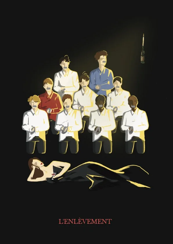
'L'Enlèvement' TO THE LEVEL Film Fest- LIVE BRIEF
Project Duration - 1 Week
Team Project Role - Illustrator
As a team, we were tasked with creating a film poster that would be used to premiere at the Nottingham student To The Level film festival. My team consisted of one illustrator (myself) and another designer whose focus was the typography and overall composition.
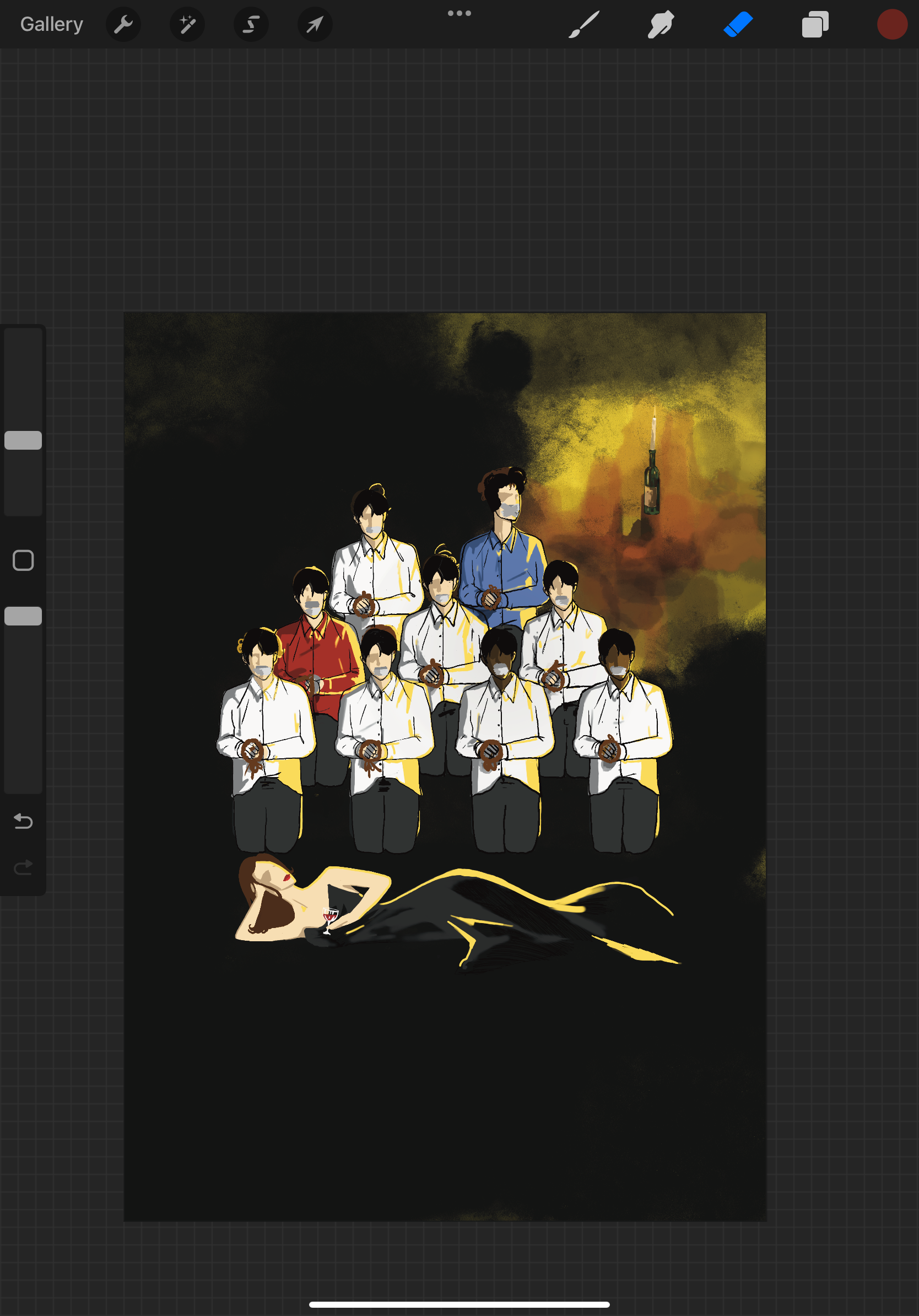
The production tells a story about a woman who invites a man over for dinner. The atmosphere is very dimly lit and the woman is wearing a red dress and red lipstick. She carries an air of someone who maintains a refined façade with an ominous undertone. The woman then asks the man to fetch her wine from the cellar downstairs. He agrees and goes down only to be met with shock when he finds a group of men tied up in the dark.
First depiction of the candle being stylised in a oil painting format
As a team, we arrived at the decision to use figure drawings that highlighted distinguishable features of each film character, recreating the scene that delivers the film’s key moment. This meant revisualizing how the female protagonist would position herself to reveal that she is both the lead and perpetrator of the film. A critique on this decision is that it may appear disrespectful to the fan base, as this is essentially a spoiler. Upon reflection, to improve the design it would have been best to find another way to signify the main character being captured or trapped without revealing too much of the story. This would preserve the mystery behind the plot, I should have developed further from this concept in order to move away from displaying the exact scene.
When drawing the characters, I used line work strategically to give guidance into the placement of shadows and light values. Giving the characters more definition and expressing emotion without drawing exact facial features. The light and shadow values in this piece is the main directive for how the atmosphere should be perceived by the audience. Positioning the candle to mainly highlight the ‘victims’ of the narrative, whilst the woman is almost blended into the dark background. This design choice was made to tell the audience that it is a much sinister character, drawing her into a more relaxed posture, to suggest control over the situation.
The Final Outcome
Upon review of my input for the final design, the light value’s linework could have been smoothed better, to elevate the design to a higher degree of refinement.
Comparing the final out come to an established film poster design (shown below), one that has a similar plot and theme. I could see more areas of improvement within my own work, and how I could have used the same methods for the final outcome to be more effective in design.

‘Girl in the Basement’, 2021 film poster
Blue is commonly used to in the graphic design industry to depict a horror film. The design for Girl in the Basement tinted the photo to a blue cooler tone, while integrating remnants of light to give the impression of a dimly lit basement. This method of expressing light could have been utilised in the L'Enlèvement design and would have given a stronger depiction of the surroundings of the victims. This would have also placed the film’s poster from the perspective of the victims in the film. As they express more emotional distress and excitement in the story, being characters the audience can sympathise with easier. The environment of the film is paramount to the storyline, so the design should have had a better focus on this area, just as the Girl in the Basement designers did.
Girl in the Basement also gives a good example of spatial arrangement, that could have give a much more personalised representation of the film if used for the L'Enlèvement design.

Highlighted proportions of the poster
The victim of the film is placed behind the offender’s head, illustrating some distance between the two figures. This provides the audience a glimpse in to the power dynamic between both characters in the film.

Highlighted proportions of the poster
In the L'Enlèvement design, the spatial arrangement doesn’t take advantage of depicting the power dynamic of the film’s characters the way that the designers of Girl in the Basement had done.
Instead, the arrangement of the tied up victims are placed in a triangle format (as highlighted in the picture above). This was purposely done to give a clear view of every character tied up in the scene. When watching the scene in the film, I carefully drew resemblances to the characters in the shot. The main offender in the film is arranged to lie on the bottom half of the poster. Although the purpose of that design choice was to allow the villain to ‘blend in with the shadows’, she still could have been scaled up more. This would have given the audience the idea that ‘despite her being on the ground, she is still bigger than them (metaphorically speaking)’.

Film Poster of ‘Audition’, 1999
Finally, there’s one more horror/ thriller film poster that exhibits similar traits to the L'Enlèvement storyline. This design has an interesting concept approach that our team could have utilised within our own project. In the Audition film poster, the female protagonist is holding her ‘weapon’ (she uses this in a very grim scene within the film) and appears to be looking at her victim, who is ‘hiding’ behind a curtain.
Perhaps another design concept me and my team could have materialised was the poster only displaying the prospective from the most active character within the story. This is very powerful in telling the audience who the narrative of the story is going to follow. The Audition design choice places the audience in adrenaline ridden shoes of the person behind the curtain.