
‘Pocket Change’ To The Level Film Festival Project- Live Brief
Project Duration: 1 Week
Group Project Role: Lead Illustrator
As a team, we were given the task of designing a film poster for the premier for the film Pocket Change. In our group, I took on the role of the illustrator, as my team mate focused on the background format and typography composition.
The film tells a story about two boys that go and steal from parked cars on the street, until one of the boy’s starts to question if the immorality of the act is worth all the excitement, whilst the other protagonist pressures him into continuing.
Until one day, a car they break into has a significant amount of money in the back seat. Finally one of the protagonist decides to give the money to the police as the other one begs him not to, only to realise that the money was a decoy set up by the police. His accomplice runs off with the bag of money, as his friend who didn’t have the intention to steal, is ironically captured and punished.

The Final Outcome
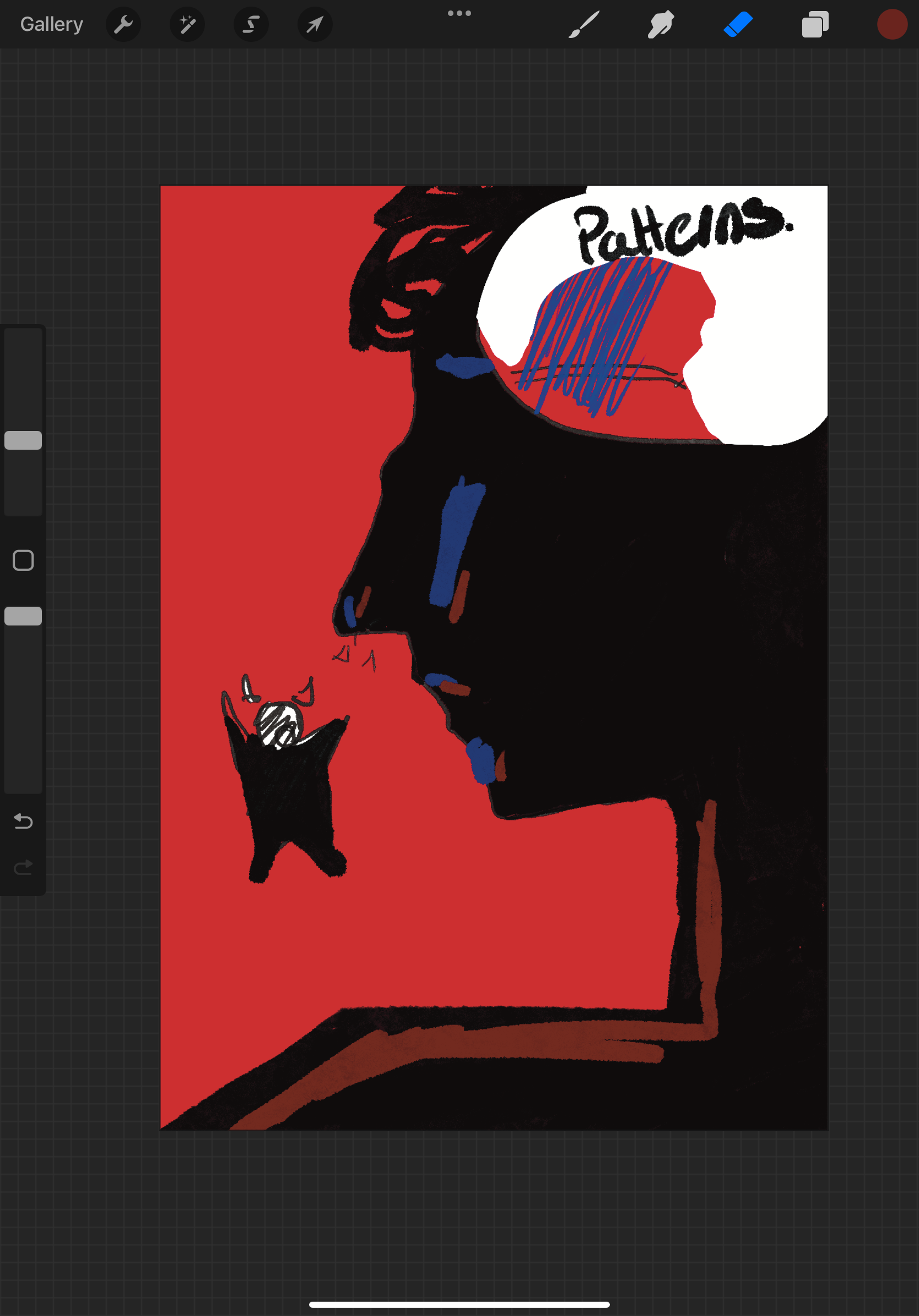
The final design plays with proportions of the characters, allowing the protagonists shadows to be amplified and signify the attitudes within the film and how they interact with each other. One having the shadow of a figure that resembles an angel and another the devil, revealing the character’s conscience and roles in the story. I sketched one frame within the scene of the film, which was a pivotal moment that foreshadowed the outcome of the story, where one character (the man with the devil shadow cast) is daunting and manipulating the other character to commit a crime whilst playing the ‘devil’s advocate. The character that has an angel figure characterised as their shadow appears uncertain and depressed.
One concept ideas created by the team
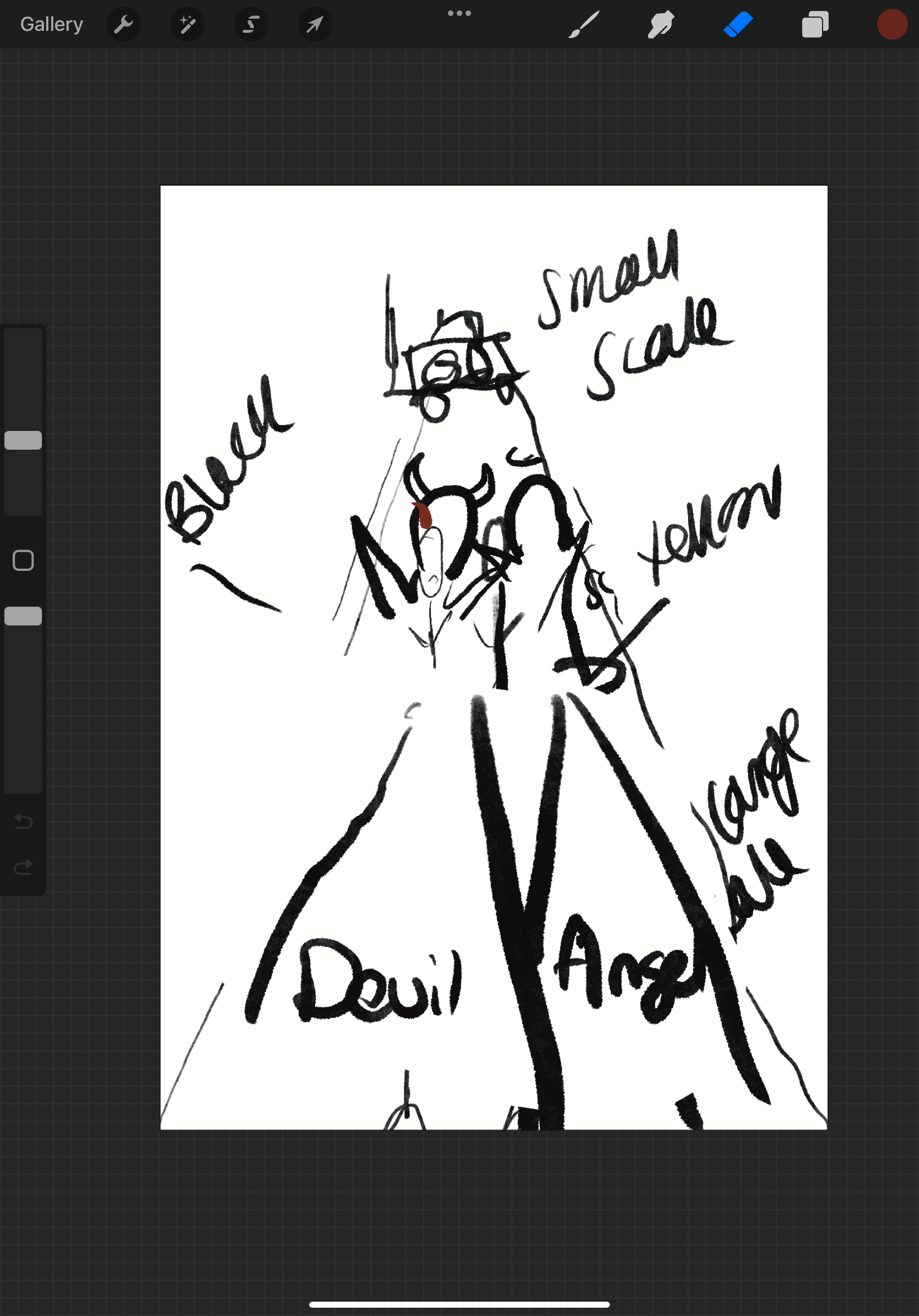
When texting of a design concept, we wanted to focus on the most critical element of the story, which is the behaviour of human conscience and ego. The roles of a ‘good’ person to a ‘bad’ person, and the mental strain the story relies on to suggest the reasoning behind the character’s action. In the sketch shown above, we thought about doing a design similar to the film cover of the 2006 psychological horror, Paprika.

Paprika, 2006
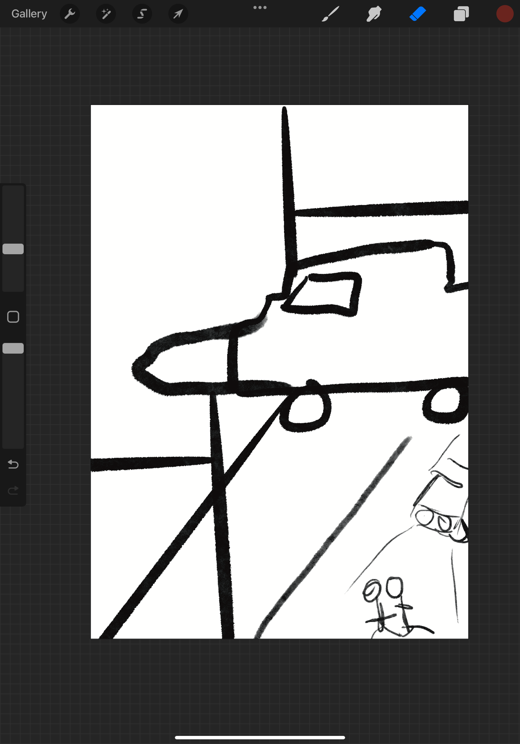
The graphic designers of Paprika heavily depicted what the main protagonist’s psychology encapsules, offering a shots and scenes within the film. This is a concept we continued to build upon, and came up with another concept (shown below) of a police car in the far distance with the shadows of the protagonist’s revealing their characters. This is where the ‘shadow’ concept first gets introduced and is then combined with the idea of what the body language of the boys giving a snap shot of the film’s premise.
Or even the way this graphic designer used the silhouette's of the film’s characters to show the roles each one plays within the movie and how the journey it takes them on.

A Little Women Concept Poster
Another sketch created during the conception stage
Another concept idea concept
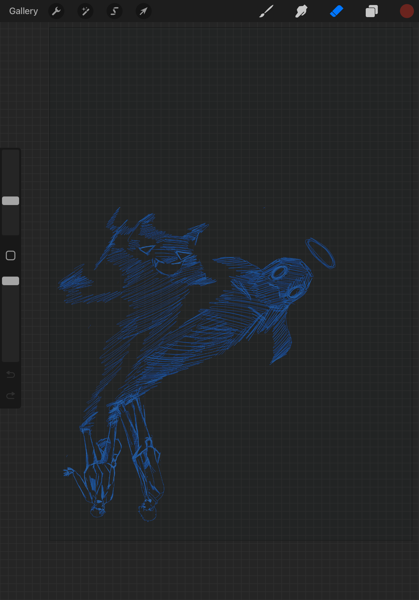
The finished sketch ready to be sent and used for the typography editor
With my contribution to the design, I believe that it would have been improved had the boys been illustrated using thicker lines. The proportional play of the drawing makes the illustration appear too faded and slightly unclear within the over image. This could have been emphasised and would have given the poster a much more direct and bold statement of what it is meant to portray.