
Self Analysis of Stencil Pitch Edits
I had a placement working at STENCIL, a graphic design studio based in Nottingham, along with other group projects I had helped them work on, I was assigned to do some illustrations for their PITCH sport's magazine. Any work I was assigned to had to be completed during the office hours, and would be finished latest by the end of the day, ready to be inserted into the final product by the editors for the following day.
One illustration job given to me was to create horse jumps for their Pitch issue 3 published in 2024. In the picture shown below, the top horse jump was the first draft. I had shown the first draft to the editors and they requested that I darkened the overall colour scheme so it would fit with the rest of the article's layout, since the rest of the page had a more cool tone theme to it. The bottom picture was a result of these changes made, I had darkened the green on Photoshop and added more sharpness to the physical objects (such as the barriers) to stop the details being faded into the background. My superior also requested that I integrate more detail so that the piece aligned with the actual horse jumps in the live photo references, so I created a small stream of water. I had also changed the perspective to be positioned more as a levelled eye view, making the overall image appear wider than the first draft.
This made the overall composition fit into a box shape, and made it easier for the editors to find a placement on their magazine's spread that worked with the rest of the images and text.
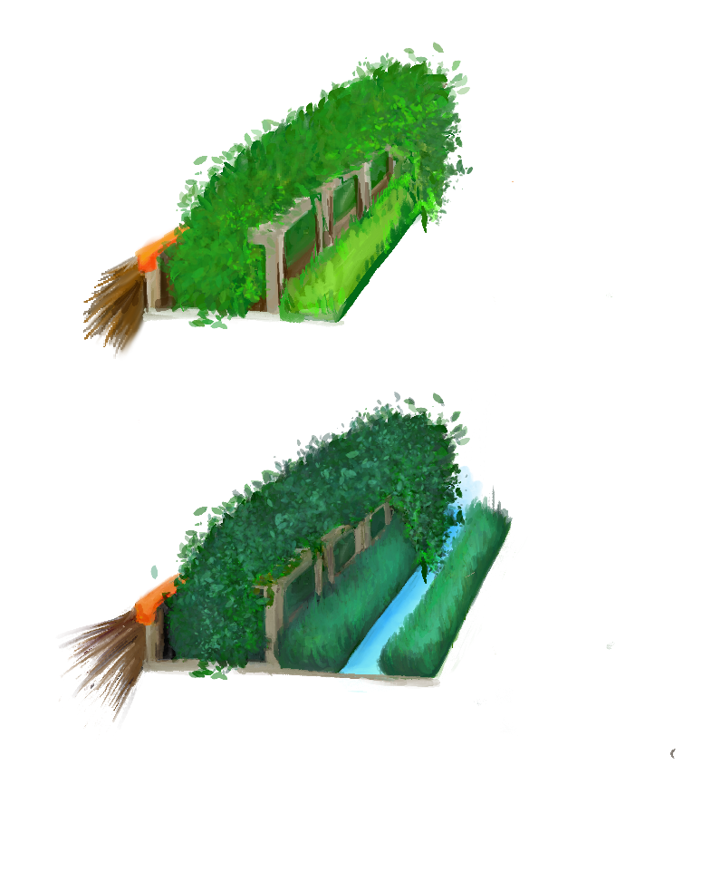
The horse jumps I illustrated for their issue 3 magazine
The photo shown below is one of the first jobs I had from Stencil, and that was to introduce the 'Stuart Broad' interview on their Instagram page. I was given a photograph of Stuart Broad and then had to edit him out from his back ground on Photoshop to produce another background that made the typography stand out, as well as choosing a suitable typeface for the post. Upon the editor's request I had to make sure that the 'Pitch' logo was visible so that viewers could associate an initial connection with the studio's brand. Trying to create a pattern with fading borders at different opacities, using contrasting colours of a cold toned orange and turquoise, the design came out very conservative. Incorporating turquoise essentially to match the colour of the athlete's eyes to tie the composition together, I could have experimented with the typography's colour as well. Although, much better research behind the player could have accelerated my design to be much more attention pulling and relevant to the subject matter.

A Instagram post I created for their Stuart Broad interview, 2023
Another edit was to help create a banner for their article on 'Lotte Wubben-Moy', in their issue 7 series.
The footballer I was designing a banner, a deck and some illustrations to go with the article's sub quotes. The interview in the magazine quoted Wubben-Moy to be extremely excited about playing football again, and felt that her playing that particular game fulfilled a long life dream for her. She's written in the interview to have a child-like excitement about her experience, this is what influenced the 'doodle' theme incorporated below.

The banner created for their issue 7 piece, 2023
My superior requested that I use a bold sans serif font, that would have to be centred in the middle of the banner, as the banner was going to serve the purpose of being functional for an online article as well. To achieve this multi-functionality, I had to test and configure the sizing before submitting it as finish work, this took several tries before getting the sizing perfect for an online view as well as to be printed on paper .

A piece I created for issue 7, 2023
Having to find previous interests of Wubben-Moy online, and tried to personalise the lay out to those said interests. For example, she played against Denmark and is recalling it in the interview, so I felt that it was relevant to include drawings that referenced that event. She also goes on to say how she visualised the crowd cheering as she scored a goal prior to the match. Wubben-Moy herself has expressed enjoying creating drawings of her own, and many of the ones drawn in her banner/ article are imitations of these drawings from her Instagram. The drawings are done using a 'crayon' type brush, to give the impression of a child's dream coming true, as Wubben-Moy mentioned she had wanted this success ever since she was young.

Taken from Lotte Wubben-Moy's Instagram page, July 21st 2023
The Picture shown above is taken from Wubben-Moy's Instagram, where most of her drawings were used to inspire this article's post.

The rest of the illustrated pieces I created for the Lotte-Wubben-Moy article, 2023
What I could have done better within this project...
When reviewing the work I had created for these articles, I felt that I could have tried with different techniques when mapping and laying out my designs for the magazine. It was have been best to try and place myself more in the position of the reader and created a piece that was more eye-catching for viewers as the designs for the banner were quite conventional in the approach. When working in a studio it is always best to offer more design options and ideas to the team, rather then making decisions in a hast to complete the task by the end of the working day out of unease of not being efficient with time management.
Comparing my work to other established magazine editors, this article for Frank Sinatra, created by 'Gay Talese' has cleverly integrated animation with the overall article.

Opening banner taken from 'Esquire.com', article 'Frank Sinatra Has a Cold', 2016
First you see the photograph, before scrolling down to reveal a grainy white traveling up towards the top of the screen. This simple animation takes the refinement of the design to a very clean and engaging level for Talese's readers. During my time working on these projects, it would have been best to look at the user journey of these designs, and suggest alternatives to how the Pitch magazine displays their format. Researching other magazine's that display this type of creativity, whilst trying not to be too experimental that it becomes almost irrelevant to the story of the article or brand, I could have taken more inspiration to how an editor would explore advancing their projects and created alternative routes as to how the final product would look. Becoming more involved with team's project is important, as long as you suggest ideas respectfully, and express compassion for the project.

Opening banner taken from 'Esquire.com', article 'Frank Sinatra Has a Cold', 2016
References
Talese, G. (2016). Frank Sinatra Has a Cold. [online] Esquire. Available at: https://www.esquire.com/news-politics/a638/frank-sinatra-has-a-cold-gay-talese/.