
Self analysis on ''Cow' campaign
Duration of Project: 1 Month
Role In Team Project: Designer and market research
Time management:
-2 weeks for design and market feedback
-2 weeks for overall research
Our brief:
Our target goal for this task is to create awareness for a demographic of females and males age ranging from 15 to 30 and above. As thrifting is increasing in popularity throughout the past couple of years, corporations have once again managed to divert the blame of our planet's environmental deterioration from their selves onto the public. We want to create eye catching advertisements that highlight the issues with green washing within thrift stores such as “Cow” and their sister companies. As our economy has dipped and financial struggles spread and deepen across the country, the growing issue of making something that once was an innocent way of people managing with low incomes to buy new clothes and recycle at once is being compromised for corporate greed.
Cow poster

One of the two mind maps that helped me to create get ideas for the design and theme

One of the two mind maps that helped me to create get ideas for the design and theme

The Very First Draft

The First Concept Further Developed for the Main Poster
When creating the poster, it was vital to copy the behaviour of Cow’s general theme and design. For the main post to be eye-catching, we included the colours of past Cow’s ad campaigns and their iconic cloud symbol to create an association between the brand and the viewer to present our campaign against them.

The ‘COW’ Logo outside their Nottingham Shop
Originally, our idea to catch the audience’s eye was to put a heading on our front poster with a very direct and blunt slogan saying ‘’YOU ARE GUILTY’’. We put it in the same font as Cow’s theme guidelines, that being ‘’Dunbar tall’’. The idea behind this concept was to create an initial emotive reaction from the viewer. As at first, the poster is blaming the public just as corporate companies do when doing unresponsible acts such as greenwashing. Considering we need the poster to preform it’s task effectively on a public street, meaning it has to grab attention at instant glance.

First Slogan Concept (with errors and typos)
Later, we decided that that may be considered too ‘’busy’’ for the tone we were going for, and could possibly detour viewers from our ad campaign. Instead, we changed the linguistics of the directive ‘’YOU’’ to simply putting ‘’COW IS GUILTY’ as viewers catch on immediately to the message we are trying to convey. We centred the header in the middle of the poster, so the viewer is guided to look below after the heading to see ‘’green washing doesn’t stop at thrifting’’. The shape of the text is curved using the ‘’wrap’’ tool on photoshop to create a ominous singing type of tone within the viewer’s head, with the sinister bright tone of red. This then mapping to the white text beside it, ‘’Find out more using the QR code’’ with ‘’out’ and ‘QR’ highlighted in the same red to create a mental connective for the viewer.
The brand (Cow) tends to stick to nostalgia within their marketing campaigns as that resonates with their target audience and the trends that are now immensely popular now. To make a tribute to the price tags on the brand’s labels, I went onto texturelabs.com and downloaded a crimpled paper type texture into photoshop.
Slides for Instagram
For the Instagram posts, we thought that playing with the colour theme of the yellow, black and white that they use, but instead creating a double entendre with suggestions to warning signs. That type of spoof plays a part in conveying the message that the brand is not safe and is doing more harm than good within its proceedings.

A model taken from the Cow website
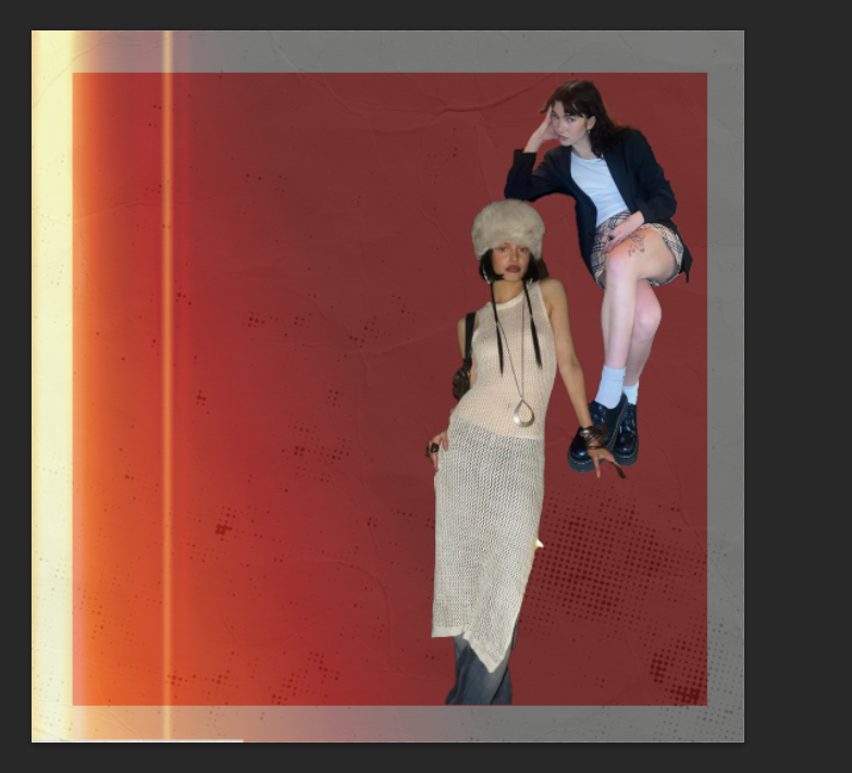
Another model taken from the Cow website and inserted into a textured background

The models were then edited with a cross on their face to introduce the sinister tone to poster, before inserting text

The final edit of the Instagram Slide

First draft of second slide, inserted the the same logo on the side but un-centred
Editing in a Model from the official COW website for the 2nd slide

The final outcome of the 2nd slide for the Instagram post
Whilst sticking to the nostalgic theme they use in their advertisements. The trend and aim are to create a simulation of the 90s to 2000s era that many people dress to now. Popular musicians all take part in this style, such as ‘’Doja cat’’ and ‘’Pinkpantherese’’ using fashion, use of technology and film to mimic the birth of what now is internet culture. These people grew within that generation which is where the nostalgia ‘close to home’ element lies, and has caught onto the generation Y to follow the fashion as they enjoy that type of media.
I made playful shapes of the headers to give the viewer an early Microsoft and Ms paint feel, and kept it reformed as possible, so our message was still clear to the viewer.
We deciding to put down open ended questions and direct headers on each slide such as:
‘’We are fast vintage’’
‘’We overprice our ‘premium’ stock
‘’Alot of our stock is NOT true vintage’’
‘’We like to greenwash’’
‘’We focus on the hottest trends at any cost’’
‘’We are just as expensive as the leading fast fashion shops like Zara and Asos’’
‘’Saying ‘environmentally conscious’ because it’s trendy’’
Talking through the company in first person as a collective with a more conscious and self-critical tone following with the emotional direction that our first header has which is ‘’guilty’’. Taking from their websites original slogan of being Environmentally conscious and playing with that statement.

The COW slogan on their website

Using the First slide’s theme, the third slide is in the same sinister format.

The final outcome of the third slide for the Instagram Post, adding in the red on 'vintage' to give it more emphasis on what our campaign’s message is.
Guidelines
For Instagram post
Red: 7c2513 (On both Instagram posts)
(Essentially ff0606, but at different opacities)
Blue Banner line: 65d7f7
Orange (On questionnaire Posts): ffa137
Font: Dunbar Tall (bold)
Colour used – Red: ff0606
Yellow: fdea00
White: f8f6f0
https://texturelabs.org/?ct=666
Textures from texture labs: ‘’Sky140’’
‘’Grunge 253’’
‘’Paper 313’’
Mock ups from ‘’free Vector’’-
https://www.freepik.com/download-limit

The final outcome of the main design
Overall, the designs used elements of the targeted company to be rearranged into a protest against what COW is doing. The designs are formatted nicely, but the type and text could have been more cohesive in each poster. The colour scheme was created and well thought out to make a direct link to the companies brand guidelines, and the research conducted produced a framework that formats very similar to the COW advertisements.
Links:
https://wp.nyu.edu/mercerstreet/2022-2023/the-ethics-of-thrifting/
Depop and thrift shopping are popular on TikTok. But is buying too much unethical? - Vox
Websites to use: