
Self analysis on Brinsley campaign
Duration of Project: 3 weeks
Role In Project: Market Researcher, Researcher, Main Designer
Primary Research: Data collected from the charity their selves
Choosing to construct a project on this charity, as in the past I have volunteered with them many times and have witnessed and spoken with the community to see what issues they have had to cope with and experienced. The owners of the charity originally began the sanction at home, rescuing wildlife that came to their door before realising that that was their passion. Soon after they expanded their living area, to accommodate the growing demand for the higher volume of animals in need.
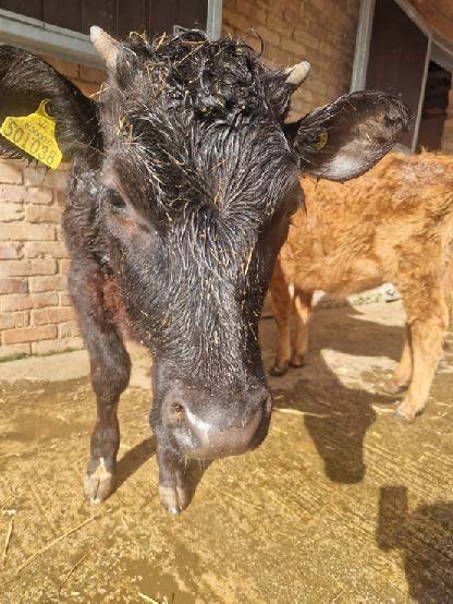
Photo taken at the sanction
The owners of the sanction, Jon Bareford and Bethan Hewis, both take it upon themselves to rescue animals who have been mistreated and abandoned. They have saved many from being slaughtered, such as battery chickens, cows, bulls, sheep, pigs, and geese. Or accepted abandoned domesticated animals such as rabbits, that are bought as ‘presents’ for children without much consideration for the care that the animal will need. There have been many cases of people releasing domesticated animals into the wild. This problem not only leaves the domesticated animal in an environment where they have not adapted survival skills for, but they could also become an invasive species to the ecosystem of that area.
The number of animals that are brought to sanction has been overwhelming for the owners and have had to unfortunately turn away many animals in need as a result.There is a big debate on whether ignorance or bad intent is more dangerous for our wildlife and eco system. In this case, there is more of present solution to solving the issue with ignorance. As the public can mean well but need to realise that they are much more complex creatures. Brinsley has hosted events with hopes of educating the public and raising money for awareness for their cause.
About the charity
The owners have installed ‘’Little owl’’ bird boxes around their estate, as the species is a very important indicator species that many around Europe are trying to help restore many areas of land so the owls will return to the habitat, and if they are happy to stay there it is a very good sign that there area has a healthy eco system.
They would take ‘waste’ from supermarkets, such as bread and bakery items and ask the volunteers to pick out what can be given to the pigs or any animal that matches the same diet there. They do sometimes ask the public to donate new papers, or blankets or so forth, but has received some back lash as people have assumed that they would take their rubbish and just leaves it outside of the building without asking or consulting the owners first.
They have their main area, 4 acres in Brinsley, and another 22 acres 15 minutes away from them, where they keep the rescue cows, bulls, ponies, and chickens. Their wildlife hospital is within their property below.They also have their own online store, where general helpers will sell their products online or at the Brinsley event and donate the proceeds to the charity. The range of items is quite big from books, jewellery, bags, t-shirts, and soaps.
They tend to have a lot of animals come and go from the sanction, but they do have some loyal and more permanent members. Such as Thomas, the 21-year-old kitten who also greets every member that enters the building. Freddie the bull, who is a very friendly giant, was born with a disfigured jaw but lives an incredibly happy life on the field. Steve the goat who will ask for head pets and likes taking pictures with you. Claudia the cow, who has glamorous hair and can be an attention diva knowing this (if anyone else gets their hair combed, she will butt them out the way and do a hair flick). The animals who have their own personalities, and even if they first came with fear and trauma, they all quickly become these loving and funny creatures that co-exist together and harmonise with each other very well.
What I think I can do for the Brand and Image
I am considering creating an add-on product for their online store, as I feel I could expand their t-shirt range to appeal to more age groups and styles. My goal is to communicate the messages that the charity would want the public to understand, whilst encouraging more to educate their selves about animal care before introducing a new family member to their home.
There are some different themes and styles to consider during the reconstruction of the brand. It is important to create an image that looks modest and ‘close to home’. I have to somehow tint certain components (for example, the ‘call for action’ posters) must have an air of valuing the charity’s cause .

Mind Map Created for Idea Development
The Demographic reach
The age range of those in the community is quite vast, it ranges from 5-year-olds to 80. Since families and students would come and volunteer at the sanction. The students tend to be studying subjects that are animal welfare related. The main aspect that the current audience all have in common is compassion for animals.

Mood Board Created for Idea Development
Feedback On Poster Thumbnails
I received the feedback came from a group of around 30 participants. This is a mixture of friends, family, and associates from the animal sanction.
The second concept was noticeably more popular than the other three designs, from its skeleton and word selection to the slogan above it. It seemed appropriate to take the framework from the second concept and structure and build upon this concept. As experimenting with a range of different colour gradients and textures to suit the T-shirt and banner design.

Thumbnails Made for Poster Concept
Feedback on the T-shirt thumbnails
I asked around 30 people, either by passers within Nottingham centre, or those who are a part of the animal sanction. I inquired them to choose what was the concept that most stood out to them and if it was possible to provide an explanation as to why they chose that design. As well as if there are any improvements that could be made or what they would like to see added.
Considering as much feedback as possible, but also understood that the nature of the environment the participants are being asked in could have affected their answers. Asking the public outright could have made many felt pressured or rushed for time to give me an answer without truly understanding the reason for their decision.
Nonetheless, the third thumbnail attracted the most people. A positive to this approach is that denying people ‘thinking time’ could gain a more natural response, (e.g., their friends choose that design, overthinking etc...). The top two were no.3 and no.2. Another issue to think about is whether the concept sketches were clear enough for the audience to decipher what is the better design when put into real life practice. To improve this, I could have developed the sketches further to make the concepts easier to envision once fully developed.

Thumbnails sketched for T-shirt Designs
Typography Development and Ethical Consideration
On the t-shirt design and final product, I chose to use ‘Jeanne Moderno OT’ as the head typeface to reinforce the brand’s name along with the art and illustrations used. This style in particular is considered more ‘’conservative’ and refined, as opposed to the character and nature of the charity itself. I orchestrated this outcome intentionally, as I thought it could be used to attract more attention from various audience categories, specifically those that are into fashion and distinct kinds of graphic T-shirts.
The style of the design goes into the ‘retro’ fashion style that is circulating more recently. Mainly, the demographic wearing these kinds of tops are millennials and generation Z.

The Idea further Developed for T-shirt Design
First Expanded Concept Draft
The ‘box’ concept I created for the no.3 concept sketch would be interesting to try and expand on the potential path for the t-shirt design. Giving the design a fairly plain colour simply to test how well the tones within the framework would harmonise together. Wanting the main the image of the sanction's fields and thought that this is a way to contribute to the landscape of Brinsley.
Overall, in the end the decision would be that the designs I had created so far, along with this expanded idea, were far too two dimensional and needs a better artistic depth by using different colour/profiles and textures. Considering that previous concept would not have succeeded in gathering attention from the main target audience and would fail to expand the charity's exposure, as that is the sole purpose of this product design.

The chosen Final Design for the T-shirt Product
Inspirations
Collecting only a limited number of inspirations to create a new board to produce a new concept. This time I chose to focus only on what aspects of the chosen photo caught my attention and annotated why that is next to it. Something I found to be a recurring theme within my decision and the popular trending Pinterest photos, was that the colour tones played a significant role in giving the photo this ‘outdoors’ themed, edgy emotive depth.
The photos that incorporated a ‘cool’ tone filter to their picture, the contrasted with the fact that most of the images in the cold toned photos had summer, warm associated images within them. That conflict ironically harmonised the whole piece together best.
The ‘’lighting’ central effect that the vibrant red in the top right’s photo produced. Despite the setting and atmosphere otherwise being very dark, the red accentuates the centre and creates the focus point for viewers.

Notes of Inspiration taken to design the Final Outcome of The T-shirt Design
Outsourcing Ethical Materials for production
In order to pay respect to the responsibility of the charity’s values of being ethical and a sustainable charity. It is important to ensure that the products they produce are also sourced from a humane environment. It is best to stay with suppliers that could provide us with products that do not contain any harsh chemicals in their production process. Must contain the fair-trade status as well as how durable the material is. The main focus would be to find a supplier that could provide organic cotton, hemp, bamboo, or any recycled materials.
One potential supplier would ‘GOEX,’ they appear to be transparent with where they source their materials from have provided the documentations on their website to reference to. The issue with this company is that it operates in the US, which has the potential to increase prices quite a lot. The motive of our product should be able to justify this to the public and the target audience. There is another material company that has a promising potential for the brand to use is ‘Am Custom Clothing,’ this company operates within the UK, so that could lower our shipping costs as well as providing high quality materials to suit our standards.
Poster
The intention behind this addition to the rebranding project was to help forward their ‘call for action and bring forth the values that they hold in the organisation.
During my time volunteering in the sanction, I have come to realise the substantial number of animals that Brinsley have had to turn away due to being overwhelmed by number. I have seen a lot of animals having to be refused due to lack of space, despite being with the charity for a noticeably short amount of time at this point.
An exceptionally substantial proportion of those animals unfortunately have had to be turned away, tend to be family that decide that they cannot accommodate for the animal anymore or have underestimated the cost of looking after another life. Essentially, a lot of these cases are due to carelessness. Understandably, some may have had unexpected life changes that could result in causing more stress and neglect for the animal if the owner does not rehome their pet responsibility (e.g., the owner could have fallen chronically ill etc...)
However, reports from The RSPCA alone from cases of abandonment have risen 25% since, 22,908 cases only this year have been reported (Jonathan Fagg and Vanessa Fillis, 2022). This issue needs to be looked after as it is the ‘simpler’ yet enormously powerful problem in our culture that needs to be reassessed and better taught to people to avoid this getting worse in the future.
With attempts to think of a way to materialize a poster that best suits the image of the brand, and that would encourage change to help reduce the numbers hopefully in the coming years.

Mind Mapping for The Poster Design

Drafting of one of the animals from the sanction (he’s name is Steve). Thinking it would be fun to personalise the design
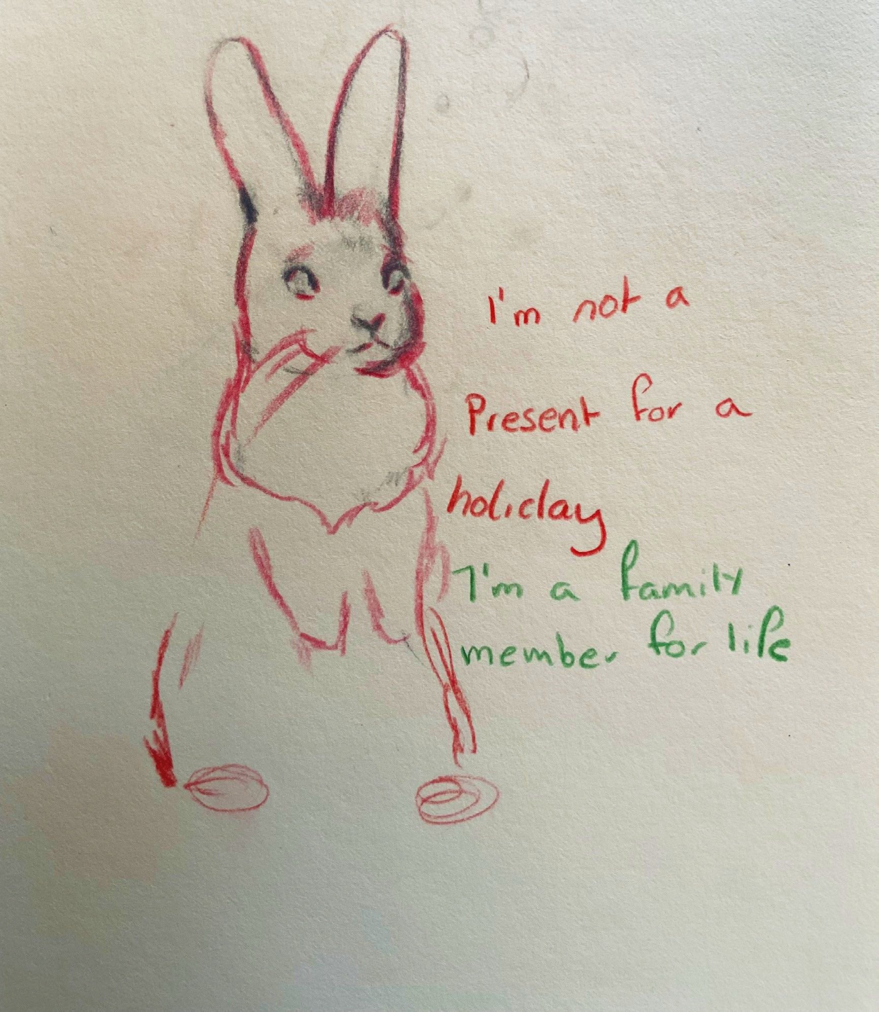
Another character from the sanction sketched out for poster ideas, along with possible slogans.

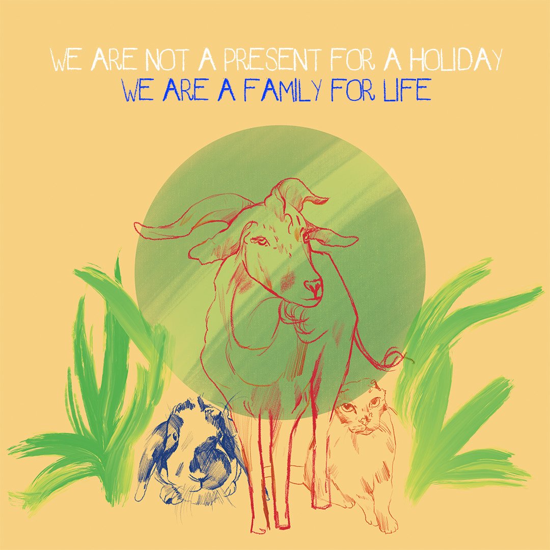
The final design illustrated on Photoshop, using a green circle to highlight the tallest character.
A bold statement is then added in a playful font, to appear with the same tone of innocence, seeming like the animals are protesting for theirselves.
Overall Evaluation
Overall, this project was to help redesign the initial image of the Brinsley charity brand. I believe that with the time given, I had created the best outcome I could.
Although that does not mean I could not have improved or expanded many aspects of the rebranded sections. This project did help to exercise and expand my skill set, for example, I have not used Figma until this point properly. Figma was greatly beneficial to the project’s outcome, especially towards producing and constructing the front page of the website and the annotations it could provide alongside this. I hope to expand on my skills with this software to gain a better understanding of how I could use the program to my advantage with future projects.
For most of the project, I used a combination of photoshop and procreate, created most of the illustrations using procreate, and the placement and touching up along with the typography aspect was inserted using Photoshop. I created more illustrative based designs, as the nature of the brand I would be best to navigate its destination to a more innocent and ‘down to earth’ appearance.
To give the stronger sense of authenticity to the label, I would recreate the images using water colour as a traditional medium and paint the characters first before then editing them on the software. I would also create a time sheet in the future to abide by religiously, to make sure that I reach self-made deadlines and take advantage of the time given for the projects as best as I can. As this is very much respected when working with real-life clients, communicating your intentions, and giving a ‘buffer’ time period to allow for better exploration of different routes for the project to follow.
T-shirt design evaluation
I am proud of the T-shirt design and would say that it fit the criteria I had set out to achieve. Using ‘Jeanne's’ typeface once again below the centre point of the image, and below that used ‘Courier new’’, to take advantage and to fill in the space underneath the first set of text, as I felt the image would have not been balanced properly if not it being a centre point. From the references I took advantage of the electric blue and brilliant red combination to make the main subject stand out. I used a ‘oil’ painted brush on procreate to spread out the background colour and to make it seem as if it’s ‘painted’ beneath the first frame of red to give it an ‘edge’ that is used a fair amount in today’s media modern fashion for graphic tee designs. To balance the sharp edge and dark tones to this image. I experimented with a cold toned, pastel green background beneath the electric blue layer, and I created a third border that caters to the 3-dimensional discipline that I felt would encourage more engagement from the audience. The stylisation of the product does detour from the rest of the original charity's image. This was an intentional approach as I thought this design could expand the exposure of the charity, considering my goal was to make it fashionable and engaging amongst young people. The type of audience I wanted to encourage were people who would have a social median platform to wear the product and automatically promote the product, pushing forward the Brinsley brand, in theory this would set a system that would have a better audience return.
The main subject is a reference photo I inserted of a woman hugging a duck with her head turned away from the viewer, leaving the duck’s head to face the ‘’camera’’. I thought this would relay a powerful message subtly that the focus should be the animal and that humans are to take care of them. For example, by leaving them alone and looking after their nature instead of domesticating them). I took the original picture from a user on Pinterest and used the ‘oil brush’ brush on Procreate to create an illuminating texture and to empathise the message by tracing and creating the shadows of image’s silhouette before adding in more biological details.
In terms of materials for the real-life production of this product, I feel as though there could have been more reform and structure given and recorded for the project. In the future I will make sure to create a timetable and an instructional spread sheet to give as much detail as possible so this can be put into practice.
Poster evaluation
As mentioned above, when looking for a reference photo I turned to Pinterest to provide me powerful statements and previous works that other animal welfare organisations had produced. An effective way to relate back to the animal sanction would be to draw and use real life animals from their charity, as they essentially are the heart of the sanction.
On the Brinsley Instagram page, and used a mixture of first-hand photo references that I had taken and the Instagram page’s blog photos of how well the animals are doing. I chose three members from the references and drew them out using procreate and their ‘pencil’ brush. I chose to stick to the pastel colour scheme and to empathise the focus of the poster by giving the characters a ‘’halo’ effect around them to symbolise their purity. The animals I chose to include in this poster were ‘Steve the goat’, Jasmin (the cat that had to her have her ears and nose removed due to cancer) and Barny (another domesticated rabbit that was abandoned in the fields).
The animals are outlined with electric colours to create a contrast to the two composing background colours used. I positioned the character’s more to the bottom of the page to later finalise and edit the poster on photoshop, adding the ‘We are not a holiday present, but a family for life.’ Using assertive and directive language to relay the message through the statement, using directives such as ‘WE’ and ‘NOT’, that uses a crayon effect in their typeface, written with the letters purposefully not a lined in an even serif to give the innocent intonation of the animal’s voices.
In the future I would want to make the poster more simplistic but effective so that the public can recognise the statement faster and for it to be more reformed and reproducible.
Comparing my Project to other campaigns
A great example of a company that has campaigned against animal testing would be the cosmetic brand, ‘Lush’. They have taken many different approaches to how they advertise their mission, and have done so in a very creative and simplistic manner that remains memorable for their customers. This reduction and reformatting would have been very effective to use within my own campaign.

Taken from the Lush website, with their fight against using animals for fashion.
References:
https://www.nottinghamshirewildlife.org/
https://www.bbcearth.com/news/can-captive-animals-ever-truly-return-to-the-wild
https://www.canva.com/en_gb/login/?redirect=%2Fmockups%2Fcollection%2Ftshirts
https://www.manypixels.co/blog/graphic-design/styles
https://www.daisyexchange.com/what-demographic-buys-used-clothes-the-most
https://www.ethicalconsumer.org/fashion-clothing/shopping-guide/ethical-t-shirts
https://www.amcustomclothing.co.uk/sustainable-ethical-printed-embroidered-clothing/
https://weare.lush.com/lush-life/our-campaigns/we-are-campaigns/